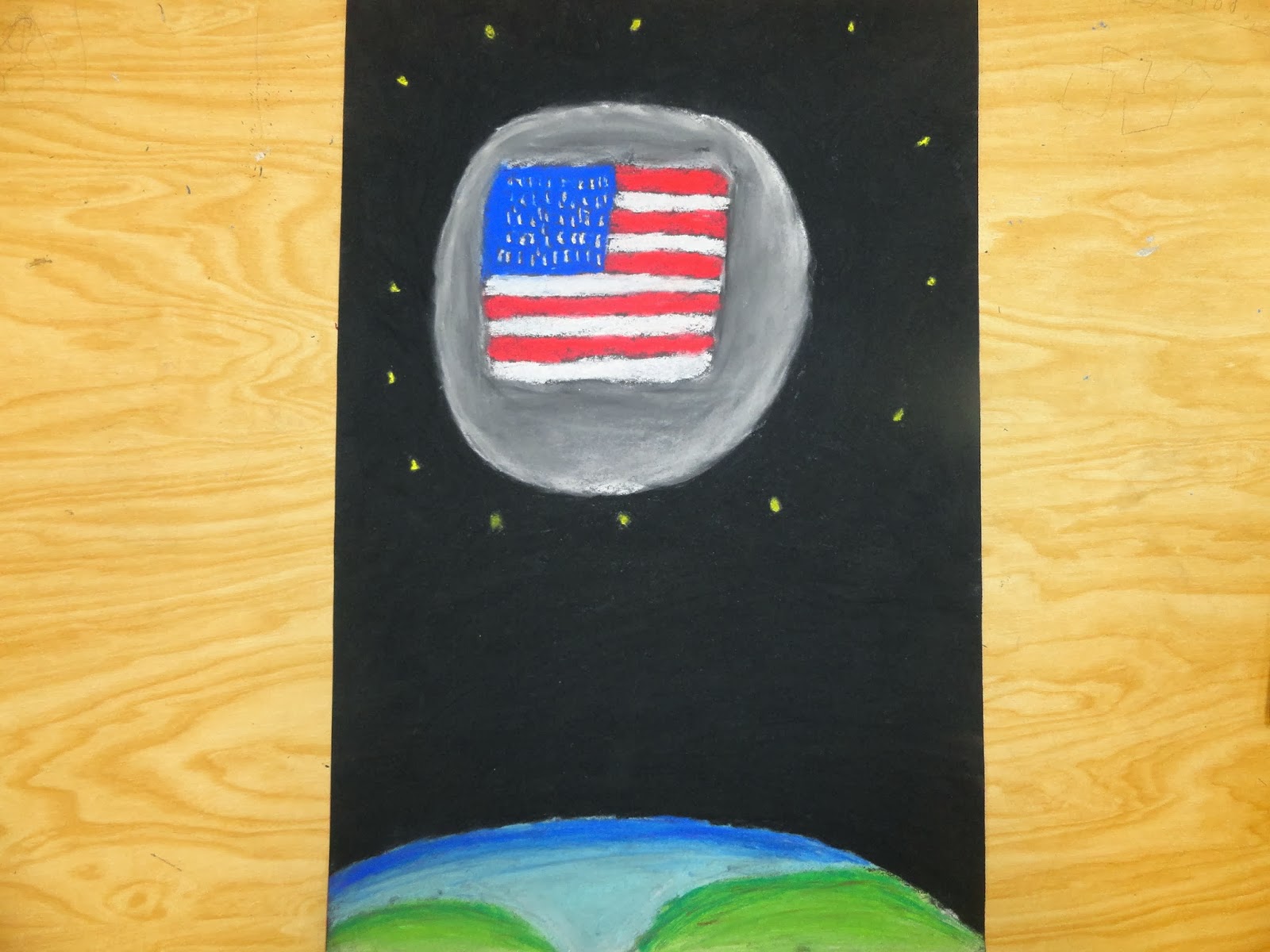
American Moon
1. Upclose and Personal was our theme. How did you develop your ideas for this project and why did you choose your subject?
Well, my original idea was a fly going up against a fan... when i realised that was bad i went onto the moon, and decided to include America in it. the moon was the center of everything, and being American is personnel, it was supposed to be on the moon... then i figured have the flag on the moon, add 13 stars, thus this was born.
2. How did you demonstrate Emphasis in your work?
I demonstrated Emphasis through colors. the darkness of space against the stars and the light earth, and the moon outline was wight. also the American flag against grey was nice. the green and blue made it more colorful as well. that is how emphasis was shown.
3. What medium did you decide to use and why did you choose this medium over the others? Discuss how it enhances your piece.
I chose to chalk pastels, for a few reasons. the chalk was easy to blend and fun to work with. i also just loved chalk as a kid, so when i saw these, i figured "hey, why don't i use these". and yeah, that's that.
4.. Did you take any risks with this project? Explain.
yes i did take a few risks. one attempting to shade the earth and moon better. i also took a risk of using chalk pastels in general, this was my first project with them, it's a new thing to me, so that in itself was a risk.
5. Of the 5 characteristics of great art (technique, concept, emotion, new, medium) which did you include in your art?
i don't think there was much technique besides shading used, unless you count using purple to shade water some sort of technique. i loved my concept to be honest, a American flag, on the moon. yup, really good idea. emotion... i don't think there was much of that shown in this, unless the American flag and 13 stars gets you all teared up for whatever reason. new? ummm i think the fact that I'm new to chalk pastels is a thing, maybe? medium, yup, using the chalk pastels was the medium, 100% sure, i used a medium of chalk pastels, and i think it worked out well.
Mountain Point
1. What where some of your solutions to What’s the Point?
there wsa so many ideas i head, i had bows and arrows, and roses, and also ideas on cactuses. though, i didn't chose any of them, i choose a pointing stick on mount everest... which i though was fun.
2. Which solution did you chose and why?
I origonally though of a pointing stick on mount everest as a joke. and well, thats what i did ironicly, only the pointing stick is barely visable in the guys hand, so its mostly just mount everest. 3. How did you show contrast in your work?
the way the mountains get darker the farther away from the sun they are, or at least what i tried to do. i also, just think it looks nice, its not amazingly detailed or anything, it just looks nice. 4. What medium did you decide to use? Why did you choose this medium over the others?
i decided to use pencil for one reason and one reason only. i can not use the pen for my life... im really bad at it. 5. What techniques did you use to create this work?
i tried to shade the mountains, i also darkened the lines of the mountain when they touched other mountains.i think it turned out well.
We
encourage risk taking in art. Risk taking can be as simple as trying a
new technique or learning about a new medium to as complex as trying
something totally new.
6. Did you take any risks with this project?
i think i took a risk drawing the person who held the pointing stick, im really bad at drawing people, so i did take a risk on that, even though mos tpeople whoudln't have any problems with it.
7. What
message are you conveying? How are you convey this message through the
use of your images or use of art elements or principles?
the message i am trying to get through is that the point is the point of the world, its the biggest point out there. also that pointing sticks are funny. i used shading on the mountains, and hoped it went well, i think it did, and the contrast between mountains also really helped with that. so in all, i think it got the point across, if you know what i mean.